Xapo Bank Activation Experience
Summary
We redesigned Xapo Bank’s in-app discovery experience to address a critical drop-off after onboarding. Despite users completing KYC, only a few made a first deposit—limiting revenue potential.
Through data analysis, user testing, and product improvements, we uncovered key friction points and introduced features that clarified value, guided exploration, and supported natural user behavior.
As a result, we increased the paid conversion rate and drove significant ARR in new subscriptions within the first few months of launch.
Team
Design VP: Luca P.
Branding assets: Savoir Fair
Product designer: Rodrigo Estrada
Visual support: Spasi Kadiyska, Carlota Anton
Product owner: Simon M.
Tech: Baris O.
Xapo Bank
2024
Timeline 3 months
Increased ARR conversion rate by 2x
Boosted discoverability on promoted features by 25%.
Increased ARR in +$ 450K.
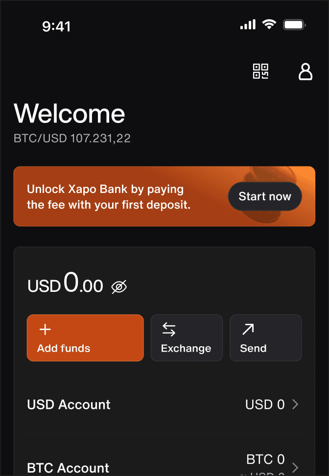
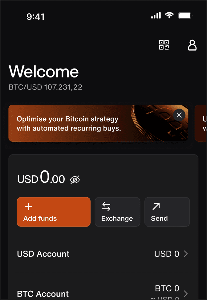
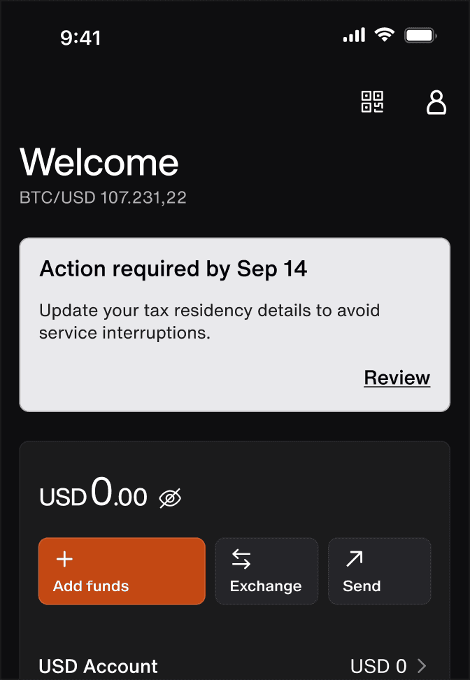
Before

After
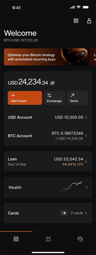
About
Private bank meets bitcoin
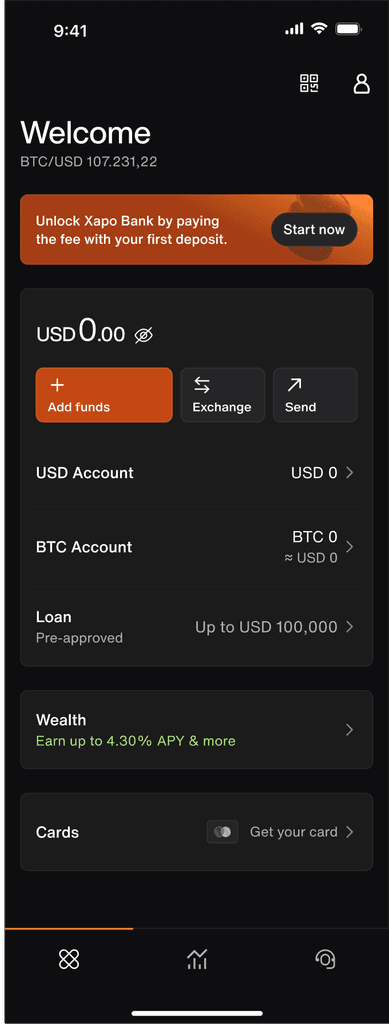
Xapo is a private bank based in Gibraltar, serving clients globally. It aims to bridge the gap between traditional finance and Bitcoin, offering a secure, all-in-one platform for holding USD and BTC. The app was designed to give users full control over their crypto and fiat savings, all while preserving the high-touch service of a private bank.
Challenge
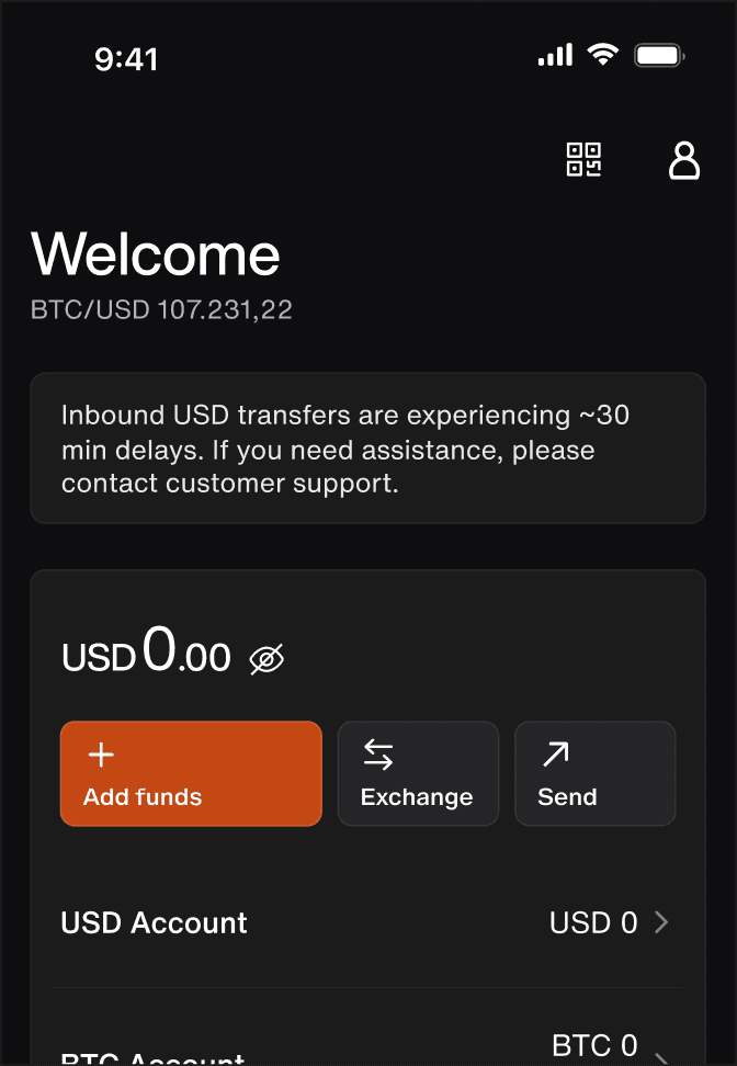
While users successfully completed KYC and opened accounts, the deposit rate (SPR) remained low—hovering. We didn’t know why users dropped off at this stage, and without answers, we couldn’t improve the conversion.
Goals
Understand user behavior post-onboarding
Identify friction points blocking the first deposit
Propose and implement UX improvements
Increase the % of users who deposit
Increase revenue

Key findings
Most discovery was happening inside the App—not on the website, contrary to assumptions
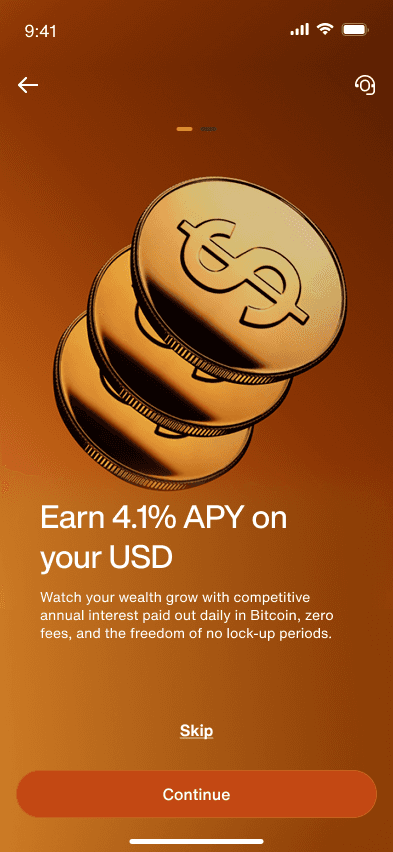
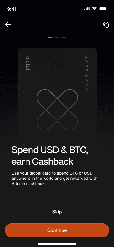
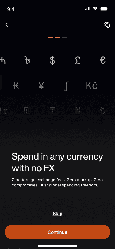
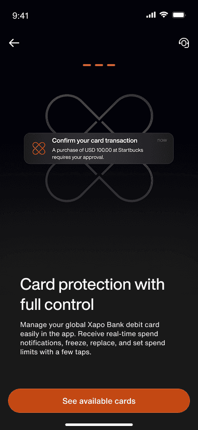
App was highly inconsistent on the approach of explaining products to the user
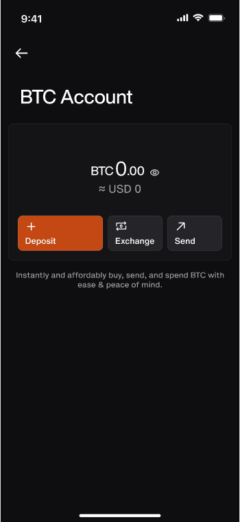
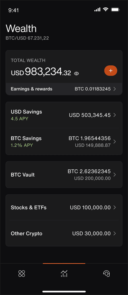
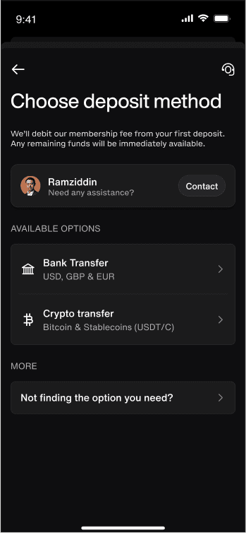
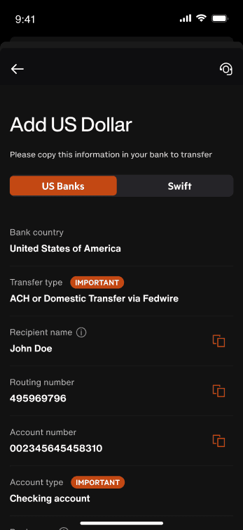
Users were confused between Checking & the Investment accounts. Payment options were unclear or difficult to use
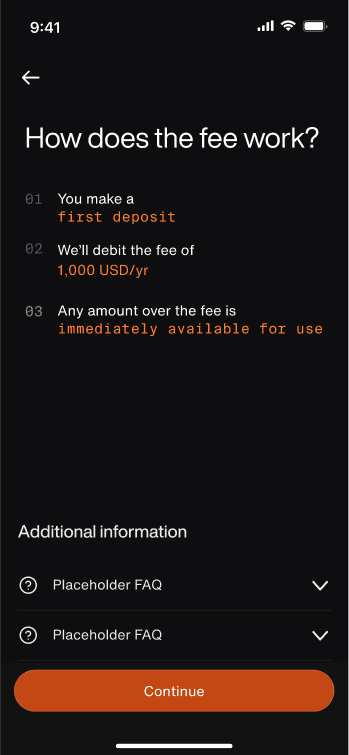
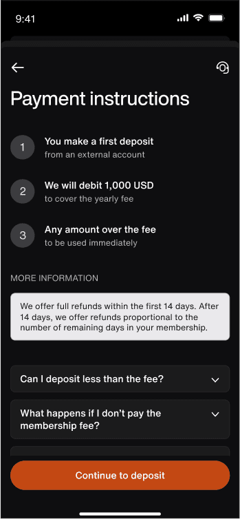
Strong expectation of a free/low cost product. Many were unaware of a membership fee until too late
Two distinct user—types emerged;
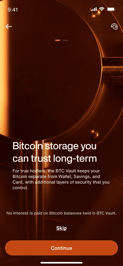
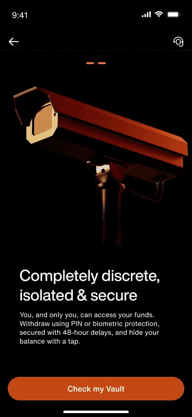
BTC users who aimed for long-term storage
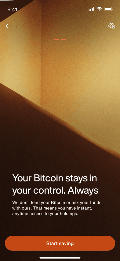
Fiat users; people who wanted to use USD & Stablecoin accounts, mostly to transact.
≈30%
of users don't come back after day 1
≈10%
% from Approved to Paid
50%
of users never check the investment tab
Problem statement


+25%
avg. increase in page views on promoted features


Explorations
We focused on reducing cognitive load and supporting natural user exploration. We started by embracing the newly developed web branding for visual consistency. Creating clearer empty states and contextual onboarding moments, and simplifying the first deposit journey

Thanks for reading this far ♥️
Disclaimer: The content and designs shown are for illustrative purposes only. Certain details have been modified to ensure confidentiality and do not represent actual company data or strategies.